Fonts to try… And a bit of research behind these theories…
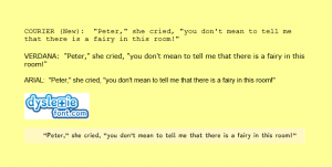
As I have been learning for months and years about Dyslexia… I have run across an article that suggests there are preferred fonts for dyslexic readers. Courier/ Verdana/ Arial/ Dyslexie Here is a link to the most recent article I read.
The statistics were really hard to figure out- to draw conclusions. I would suggest try any of the suggestions in the image below to see if they help your reader.
The Dyslexie Font can be purchased, downloaded and used from this site. They offer neat books, and other curriculum aids, feel free to explore their products!
Here is a link to some CBS News information on the Dyslexie font!
Evaluating Textbooks: Visual vs. Text-Based
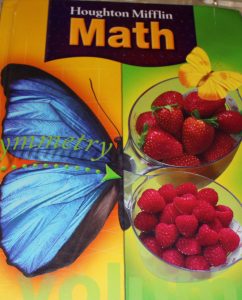
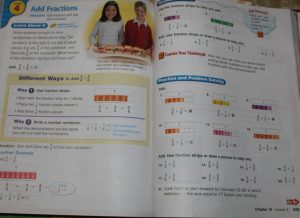
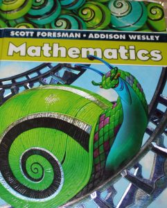
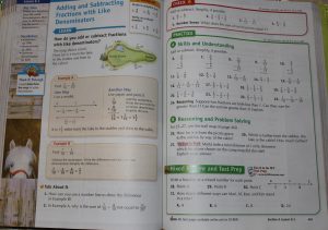
Not all textbooks are the same. Here are two samples from Elementary/ Basic Mathematics textbooks. The Houghton Mifflin text (above) has many more visualizations [data bars] here to assist in teaching how to add fractions. The Scott Foresman text below has fewer visuals, but more numerical-text practice.
To evaluate supplemental materials for your visual-spatial child; seek out those with many visuals, illustrations & diagrams.
In the Adult Educational array of curriculum currently available; few if any visual offerings exist. It is ok to look to supplement your resources with a more ‘elementary’ style of textbook like those shown here to use with an adult student. The goal is to help them learn… if they learn more easily and quickly when visualizations are available.. then find them and use them.
